What do you guys say
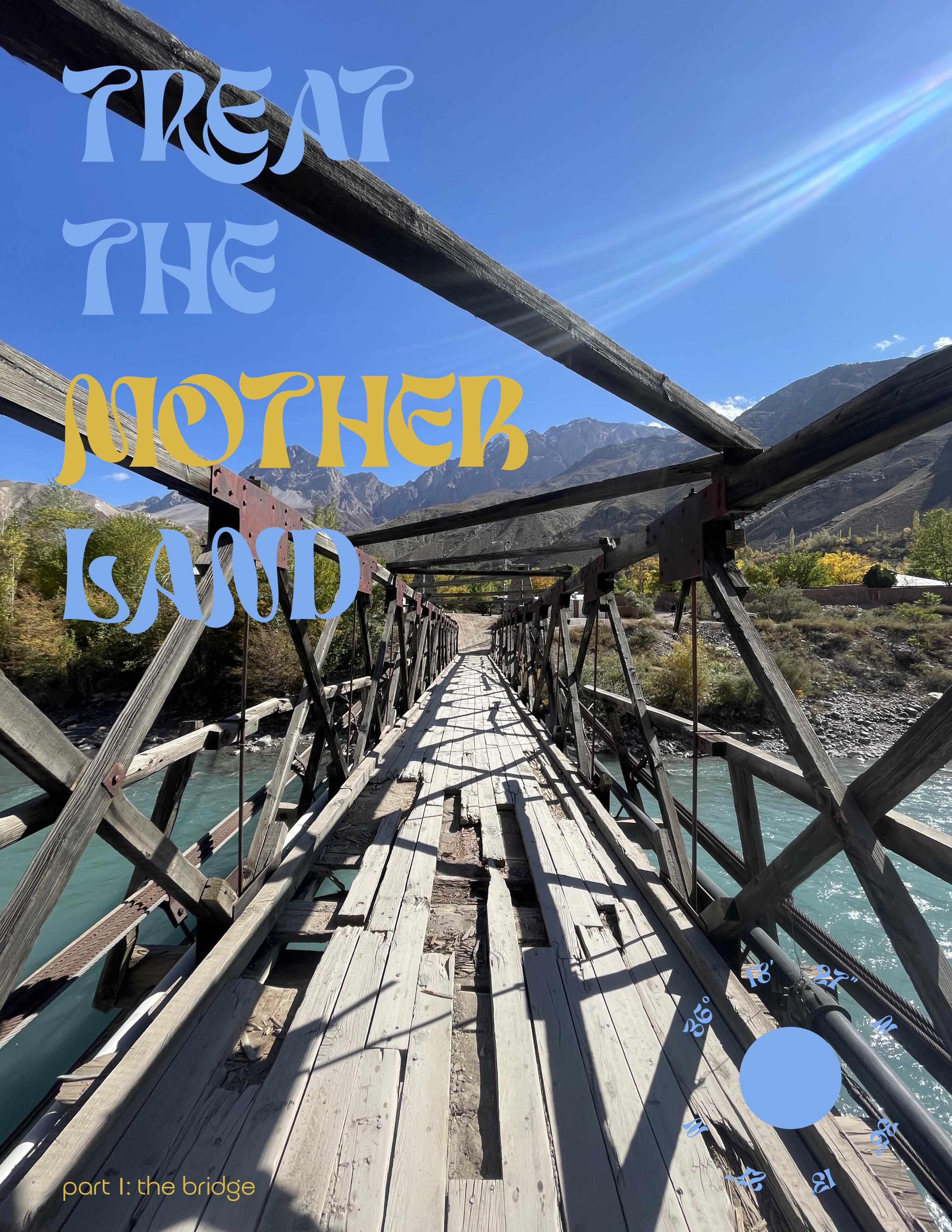
Hey everyone, I’m working on a poster series that centers around environmental and cultural storytelling, starting with this piece titled “The Bridge.” It’s part of a project that explores themes of neglect and preservation in highlands and valleys. The imagery and typography are meant to contrast natural beauty with human impact.
I will be using other photographs around the valleys, and then the style is gonna be consistent pretty much maybe the colors for the type and overall design might differ just to compliment the photograph. Also at the bottom right I’m thinking of putting the coordinates of where the pictures are taken.l and bottom left will be the title of that specific poster.
I’d love any feedback on the composition, typography, or how the message comes across, especially if anything feels off or could be improved.
Thanks in advance!