
Exploring a Simple Hotel TV Menu Design, looking for feedback
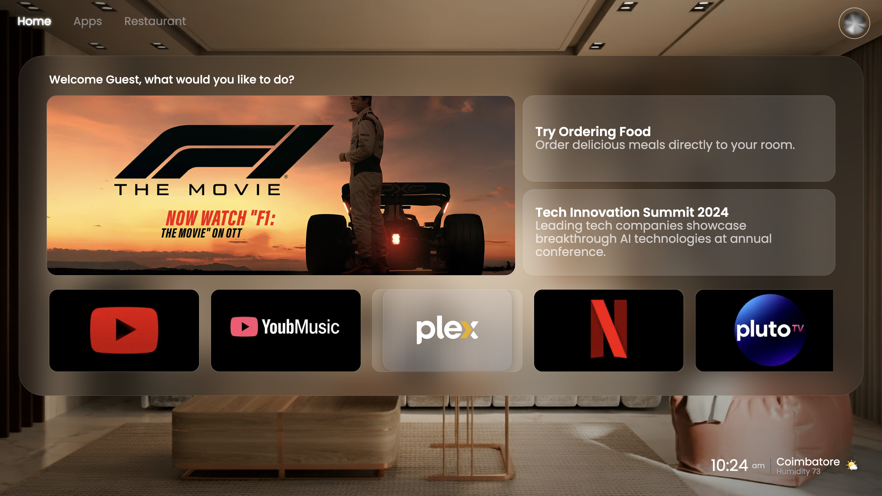
I’m an amateur designer and created this UI for a friend’s college project. The idea is a TV operating system for hotels. The goal is to give guests simple access to a few essentials: apps (like streaming), a food ordering menu, and some basic hotel information.
**Objective & Audience:**
The main audience is hotel guests who may not be tech-savvy. The priority is ease of use and readability from a distance, since it’s on a TV screen.
**Design Decisions:**
* Focused on a limited set of core features to avoid overwhelming users.
* Iterated a few times to keep the navigation straightforward.
* Used a clean grid layout to make elements discoverable and easy to read.
**What I Need Help With:**
While I think the layout communicates the basics, it feels like it’s missing the professional polish you’d see in a commercial product. I’d love critique on:
* Typography and visual hierarchy
* Spacing and balance
* Color choices and overall visual appeal
* Any interaction/UX improvements I might be missing
Thanks in advance for any suggestions!