
Looking for feedback on typography
Hello! I’m writing because I need feedback or critique on the text at the top.
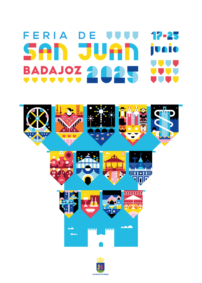
This is a poster for a fair of my city. In Spain, the pennant is a common element in the streets when there is a popular fair, so I wanted to experiment with the geometry of the pennant as a container for scenes, and I also wanted the typography to have a certain presence. (the moderators have told me to explain everything in the section of comments, so if you need more context or info, the first comment explains everything)
I wanted to give an impression of homogeneity, where the typography works as another geometric element alongside the illustration—not as if the illustration was created first and the typography was added afterward.
I’m trying to organize everything into two blocks: the first block of information (it’s a fair, it’s in Badajoz, and it’s in 2025); and the second block (the date). Following the poster’s narrative (the pennants), I’m filling the white gaps between the text with pennants: this way, the block structure becomes more evident, and at the same time, these two blocks generate a solid text band at the top, which reinforces the perspective idea (the poster represents the perspective of a street).
Here are the things that concern me:
* I’m not sure if the pennants distract too much attention with all their colors.
* I want to keep the color palette of the illustration within the text. Using black text would probably be better for legibility, but if I use it, I’d lose the geometric quality of the letters.
* I don’t know if all that geometry overwhelms the eye in the text. For this reason, I’m unsure if I should give up the geometric letters in *June 17–25*.
* I also don’t know if, at first glance, the text might look childish because of the blue–yellow–red combination. Thinking about the communicative function of a poster, I feel the text should be a clear, neutral part. At the same time, I want it to convey a professional image (for instance, by using an extra-bold geometric font in *SAN JUAN*), though I still find playing with geometry in *SAN JUAN* and *2025* interesting.
* I’m not sure if I should use the same font for *FERIA DE* and *BADAJOZ.*
In short, I’m not sure how to strike the right balance between geometry, color palette, and typography.
Edit: this is the actual poster with some changes
https://preview.redd.it/q82azcr5swqf1.png?width=800&format=png&auto=webp&s=3b4d2afd9c03113f646d7eb436e1a924c76f46f3