Can’t figure out the grid system of responsive websites — help
Hi! I’m a student learning UI/UX by trying to replicate full websites in Figma, pixel by pixel.
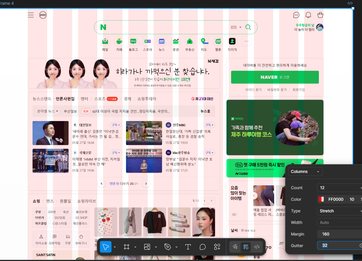
I captured a responsive site using GoFullPage (1920×1080, 100% zoom), but I can't seem to figure out the correct grid — things feel misaligned.
I've attached a screenshot \[imgur link\].
How can I identify the exact grid values or settings of a responsive site?
I spent the whole day on this, but I still have no idea how it’s supposed to work. Any advice would mean a lot. Thank you!